Wayfinding: Not Just about Signage

By Jane Rohde

Introduction

This month, Sunbrella is bringing to you; Wayfinding: Not Just about Signage!  Designing a complete wayfinding system improves a healthcare experience for patients, residents, visitors and families, and visiting physicians and care givers. In some cases, it may be a temporary stay or a first time visit to a complicated healthcare campus.  At other times, a consistent wayfinding system may reinforce or cue residents with memory care issues that live in a smaller residentially-scaled community.  Regardless of the setting, clear and easy to find spaces and locations, reduces stress for the person who is confused, potentially upset, or someone already worried about a procedure or a loved one.  

Simplification and Focus

Too much information places an already stressed person into overload.  Overload can be exacerbated not only by a confusing or inadequate wayfinding system, but also poor acoustics and lighting.  A person doesn’t know where they are going, they can’t see well as they seek out signage or a person to assist them, and a noisy environment adds to the overall chaos for an individual, who simply wants to know how to get to their destination or loved one. There is a term, progressive disclosure[1] that is often referenced in the computer and tech world, but has good application to wayfinding;  “maintain the focus of a user’s attention by reducing clutter, confusion, and cognitive workload – only presenting the minimum data required {effective wayfinding} for the task at hand {finding destination}”.[2]

Users and Wayfinding

Because people do not process information in the same way; some do better with a map or GPS, which can be both visual and auditory.  Some facilities provide kiosks or apps that are used on their phones to help people find where they are going within complex healthcare settings.  Designing a wayfinding system includes a global approach for a community or campus, requiring an evaluation of the arrival approach and evaluating all circulation paths (vehicular and pedestrian), including the departure or discharge process (where applicable).  For residents living in an established community, the evaluation starts with “a day in the life of a resident” to better understand the sequence of life events and where a question would occur as a decision point; such as four intersecting corridors.  No matter the setting, looking at each point in a circulation path and identifying where a decision has to be made is critical.  Followed by prioritization of the location in the overall context of the setting. Choosing specific landmarks, artwork, accessories, color, music, or other types of cues can be beneficial for most users when provided in conjunction with signage; including directional signs, “named” rooms or spaces, and systematic numbering of spaces.

Garden Spot Village located in New Holland, PA is a continuing care retirement community that has an exceptional landmark within their community entry.  There is a metal tree sculpture in the entry lobby that connects four major pathways – is visible from a staircase, and is accessible to a coffee bar, water station, fish tank, and reception desk.  When the sculptor asked Steve Lindsey, the Executive Director, the significance of the sculpture prior to completing the design, Steve explained how the community supports a person-centered model of care – embracing everyday life down to the details.  The sculptor came back with not only the exquisite tree as the center landmark and focal point, but also added Patina and Sparky – two movable squirrels.  One-day Steve arrived in his office to find a tiny paper bag on his desk.  Inside were two small scarfs, two of many that reflected the season and time of year for Patina and Sparky.  Not only does the tree act as a landmark, but also a conversation starter and allows residents to participate in the sculpture on a seasonal basis!

[1] https://en.wikipedia.org/wiki/Progressive_disclosure

[2] Huelat, B. J., Position Paper for The Center for Health Design’s Environmental Standards Council, 2007 1.0. (https://www.healthdesign.org/system/files/WayfindingPositionPaper.pdf)

IMG_8800.jpg

Garden Spot Entry. Architect: RLPS. Photographer: Nicole Lowder, JSR Associates, Inc.

IMG_8787.jpg

Garden Spot Entry. Architect: RLPS. Photographer: Nicole Lowder, JSR Associates, Inc.


Branding

Sometimes branding does not align with the wayfinding within a healthcare campus or continuing care retirement community – which is a missed opportunity.  If consistency is achieved, all components reinforce a positive experience as a person moves through interior and exterior space. All social media, websites, and other internet presence gives the user or consumer the opportunity to already be familiar with an organization before they even reach the arrival entry.  Seeing something familiar, provides an initial comfort level that they are entering the right place as a first step in finding their final destination.  This additional reinforcement supports recall by the user in anticipation of a visit.  For examples and additional information about branding and wayfinding, see the Society for Environmental Graphic Design (SEGD), which is a multidisciplinary community creating experiences that connect people to place (https://segd.org/).

HOW HEALTHCARE DESIGNERS CAN USE EVIDENCE TO CREATE OPTIMAL HEALING ENVIRONMENTS

by: Jane Rohde

Evidence-based design was developed and supported by The Center for Health Design (The Center), which is currently celebrating its 25th year as a non-profit organization. The Center is based on promoting research, education, and advocacy for the design of successful healthcare environments and has developed various “toolboxes” and issue briefs as resources for using EBD principles for innovative solutions.

EBD TOOLBOX: BEHAVIORAL & MENTAL HEALTH

The Center has recently released a Behavioral & Mental Health (BMH) Toolbox, which has been developed because 45 percent of patients admitted to a hospital for a medical condition or who visit an emergency department also have a concurrent BMH condition. This toolbox is complementary to the addition of a chapter on substance abuse treatment centers included in the 2018 Guidelines for Design and Construction of Residential Health, Care, and Support Facilities.

POTENTIAL DESIGN STRATEGIES FOR SUPPORTIVE ENVIRONMENTS: BEHAVIORAL & MENTAL HEALTH

  • A homelike, de-institutionalized environment supportive of patient autonomy and control over a personal environment
  • An environment that is well-maintained and well-organized
  • Noise control
  • Support of privacy
  • Access to daylight and views of nature
  • Physical access to the outdoors
  • Support of personal safety/security
  • Support for social interaction
  • Positive distraction

This listing of design strategies is applicable to all types of healing environments and can work for emergency rooms, outpatient settings, and hospitals. These approaches continue to be successfully utilized in senior living settings including memory care facilities, providing not only positive outcomes for residents but also staff, family members, and visitors. It is time for the crossover and integration of all environments that provide care, support, and services to consider the complexities of the care populations being served and person-centered approaches for all constituents and stakeholders. 

Intimacy is not typically a term utilized when describing healthcare settings. However, an individual’s health and well-being are extremely personal. If design was approached from an intimate level—looking at each personal human interaction from the entry sequence through meeting with care providers, being admitted, family visits, and subsequent follow-up—it would provide context for developing smaller-scaled spaces with good acoustics, lighting levels to support various personal or group tasks, wayfinding systems, and the needs for respite in a quiet outdoor space or a sun room.

A HEALING EXAMPLE: THE WAITING ROOM

During programming and planning, we talk about the function of what occurs in an area or room but often do not address actual examples of personal interactions that may occur within a certain space. For example, let’s take a waiting room with tables, chairs, maybe a TV and possibly vending machines. Consider a scenario in which a couple arrives and is directed to a waiting room and a doctor comes out with sad news: a diagnosis of cancer for a loved one, a death of a friend, or the loss of a child. That waiting room is now a place where sad information must be delivered. An adjacent private space, an opportunity to have a glass of water, and access to the outside for a breather should be considered based upon the human interaction.

The waiting room isn’t just a waiting room—it is a place where a full spectrum of emotions from sadness to joy is delivered. It is a place where family members come together. It can offer overnight accommodations or it can be a place where a meal is consumed. Identifying the personal interactions allow for the design to be so much more than a waiting room but a place of comfort scaled to accommodate the privacy needs of patients’ family members and friends.

If this framework were utilized as a health and wellness overlay in a BIM model, think of what could be identified as conflicts; this could affect the size and scale of lobbies and amenities offered, the sizing of patient rooms, and simplifying point-of-service operational flows to accommodate staff. We think of BIM models as identifying conflicts with building systems but what if it were expanded to identify places of human interaction? This is a tool that helps address person-centered design based upon the research that establishes the framework for decision making and relevant design strategies to fulfill the intimate needs required of a space.

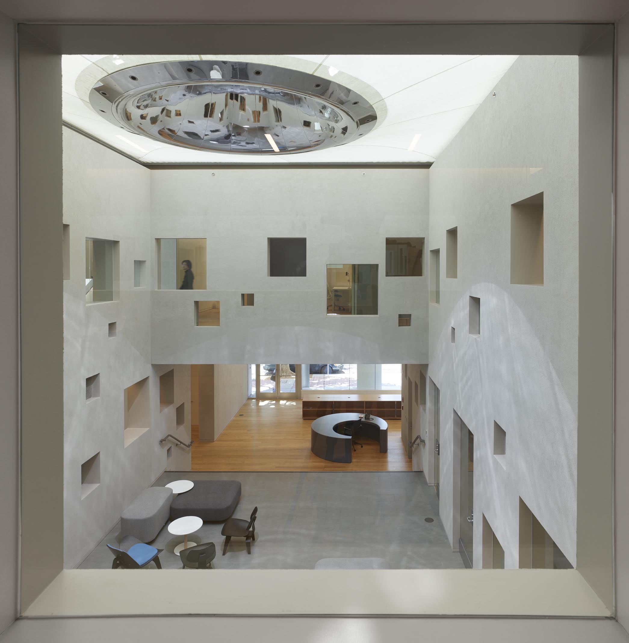
The Terasaki Research Institute, completed by Atelier Hitoshi Abe in Los Angeles near UCLA’s campus, exemplifies the need to address human interaction and caring. The institute focuses on organ transplants and wanted an innovative and engaging space. The beautiful interior atrium provides access to daylight supporting human interaction—learning, working, and holding public events within the space. Acoustics and seating arrangements were addressed to accommodate the various uses while supporting human comfort.

Photograph 1_Roland Halbe_2546-0091.jpg
Photograph 2_Roland Halbe_2546-0119.jpg

The utilization of openings throughout the two stories of mezzanines provides wayfinding landmark placements and opportunities for daylighting and engagement, giving the spaces a sense of place while connecting to the outside and vice versa.

Photograph 3_Roland Halbe_2546-0117.jpg
Photograph 4_Roland Halbe_2546-0067.jpg

To coin a new phrase, the “environmental program for human interaction” could become another way to support person-centered healthcare projects with human-to-human interaction being the evaluation and overlay in planning and designing healthcare environments of the future. 


Photography: Roland Halbe
Architect: Atelier Hitoshi Abe